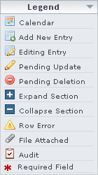
Legends
The following legends are present on all forms pages.

Legends
Required Legend
The Required Legend informs the user of which inputs are required. This legend is present on all forms pages, even if there are no required fields.
Form Legend
A legend of all helpful icons is presented on pages as needed to explain the relevant meanings. This helps the user become familiar with any new icon representations in context with the form or page as it is used. The legend contain a predetermined set of general icons across the site. The legend does not display information dynamically.
Click the Legend icon to open it.

Legend Icon

Open Legend
Legend Icon Definitions
| Icon | Description |
|---|---|
|
|
Calendar - Indicates a date field which has a visual calendar widget from which a user may choose a date. The calendar widget is evoked by focusing on the date text field or by clicking on the icon. A date is selected by clicking on any day associated with the currently displayed month and year. Month and year may be changed using the arrows at the top of the calendar. The double arrow changes the year, while the single arrow changes the month. A user may also type a date into the date text field instead of using the widget |
|
|
Add New Entry - The "Add New Entry" icon appears in the first column of the last row in a data table that has the capability to add rows containing new information. This icon shows that the cells in the associated row contain new form inputs. Once all the information in a row is completed, click the 'Add' button to add the new information to the data table. Some rows are associated with detailed row information that is revealed upon clicking 'Add'. In most cases, there are required fields within the detailed row information. The detailed information must be completed and submitted for the new row to be complete. |
|
|
Edit Entry - The "Edit Entry" icon appears in the first column of a row that is currently being edited. Row Edit Buttons that allow the user to commit changes, cancel, or delete the row will show up (depending on the data table) when a row is being edited |
|
|
Pending Update - The "Pending Update" icon appears in the first column of a row that has recently been updated, but has not been submitted to the database with the current page as a whole |
|
|
Pending Deletion - The "Pending Delete" icon appears in the first column of a row that has recently been "deleted", but has not been submitted to the database with the current page as a whole. After page submission the row will no longer be visible. The same icon is used in some instances as a clickable action to delete a row immediately |
|
|
Expand Section - Expandable sections are represented by a blue title bar. A blue title bar with the "Expand Section" icon signifies there is hidden information that may be expanded. Click anywhere on the blue title bar to expand the hidden information |
|
|
Collapse Section - Expandable sections are represented by a blue title bar. A blue title bar with the "Collapse Section" icon signifies contained information that may be hidden. Click anywhere on the blue title bar to hide the contained information associated with the blue title bar. Information within "collapsed" sections will generally be submitted upon form submission regardless of whether the information is showing on the screen |
|
|
Row Error - |
|
|
File Attached - |
|
|
Audit - The "Audit History" icon appears after a form field that has an associated audit trail. Clicking on the Audit History Icon allows a user to see the update history for the associated field including the content and user who made a change |
|
|
Required Field - |