Tables and Forms
Tables
All tables have identifiable header rows and are zebra-striped to increase readability.
Forms
Form elements are organized into logical groups for speed of entry and ease of use.
Required Fields
All forms have fields in which user input is required in order to continue to the next step in the input process. Required fields are marked with a red asterisk to the left of the input field, before the form label [  ].
].

Required Input Field
Labels
Labels appear in three forms:
- Input Form labels appear to the left of the input field for regular text input and are followed by a colon character.

- Input form labels for radio buttons and check boxes are on the right of the input and are not be followed by a colon.

- Results labels are not bold but the values to the right are bold.
Tabindex
The form tabbing order automatically begins with the first form element on the page.
Radio Button Group
Radio button groups are used for less than five options or where it makes sense visually.

Radio Button Group
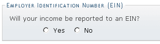
"singleQ" Radio Button Group
Combo/Select Box
The first option available is be blank, and no option is set as selected.

Combo/Select Box
Check Box Group

Check Box Group
Generally, check boxes are used for on/off switches or "yes/no" questions depending on context and need.
Selections Requiring More Detail
There are instances when a selection, especially in the registration process, requires further clarification depending on the answer. To this end, a method has been created to hide or show the details in an element below the form element. Below is a simplified example with a radio button group:


Below is a simplified example with a check box:

